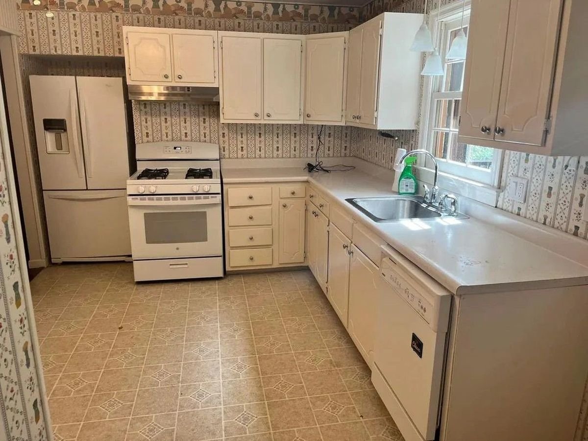
Want a kitchen that feels open rather than boxy with wallpaper, bulky cabinets and dated finishes? This remodel was shared by a Reddit user u/Few_Whereas5206 Almost every surface in the room changed, from the cabinet fronts and flooring to the sink wall and refrigerator layout.
Muted sage cabinets, dark oak floors, white counters and cleaner lines transformed the kitchen from a cramped 1990s layout into something that feels brighter, calmer and more current without losing character.

Patterned wallpaper covers every surface
Before the remodel, striped wallpaper wrapped around every wall and ceiling border.
Repetitive prints compete with flooring, cabinets and appliances at once. Despite the large windows, the room still seemed dark because every surface was visually cluttered.
Nothing stood out in the kitchen as everything blended together in a beige pattern.

Old cabinet fronts make the kitchen look dated
The biggest change came in replacing the original cabinet doors and drawer fronts.
Before the remodel, curved raised-panel cabinet fronts were common in older builder-grade kitchens. Small upper cabinets and uneven cabinet heights make the walls feel cut.
After renovation, Shaker-style cabinet fronts Introduced straight lines across the room. Tall cabinetry and crown molding also push the cabinets closer to the ceiling, making the kitchen appear larger.

The sink wall began to feel open rather than crowded
The original sink wall felt boxed in by the cabinetry on either side of the window.
The upper cabinets interrupted the line of sight and made the center section feel tighter than it actually was. After the remodel, removing the cabinets next to the windows changed how the entire wall looked.
Floating wooden shelves replaced part of the upper cabinetry and opened up space around the sink area.
Natural light now diffuses across the counters instead of being trapped between cabinet boxes.

The stainless steel sink was replaced with a farmhouse apron sink
One of the most visible improvements came from replacing the old drop-in stainless steel sink.
Before the remodel, the sink blended into the laminate counters and disappeared into the surrounding beige finish. After the renovation, the white farmhouse apron sink became part of the kitchen design rather than just a utility feature.
The deep front profile also breaks up long cabinet runs and gives the sink wall a stronger focal point.

Sage cabinets replaced flat cream finish
Instead of replacing the kitchen with bright white cabinets, the remodel introduced muted sage tones throughout the room.
That color immediately separated the cabinetry from the backsplash and counters. Soft green also works with dark flooring and brass hardware without making the kitchen look cold.

Dark oak floors replaced the busy vinyl pattern
Old vinyl flooring adds another layer of pattern beneath the wallpaper.
After the remodel, dark oak flooring grounded the kitchen with cleaner lines and strong contrast under lighter cabinets. The wood grain also introduced movement without making the room feel busy again.
Many reviewers cited the flooring as the strongest upgrade in the remodel.

Stop looking at the refrigerator hiding in the corner
Before the remodel, the refrigerator looked shoved into a side wall without much connection to the rest of the kitchen.
The new layout framed the refrigerator with surrounding cabinetry, allowing the appliance to integrate into the room rather than being added later.
That single change instantly balanced the back wall.

White subway tile replaced the wallpaper clutter
Removing the wallpaper instantly transformed the kitchen, but the backsplash completed the transformation.
Glossy white subway tile now reflects light on the counters while giving sharper definition to the sage cabinets. Instead of layering patterns on every surface, the remodel concentrates texture in small details like wood shelves, brass pulls and flooring grain.
The kitchen looks cleaner because there are fewer surfaces competing for attention.

Brass hardware added contrast without looking overwhelming
Original kitchens used small round knobs that blended into the cabinet fronts.
After the remodel, long brass pulls presented a strong contrast across the sage cabinetry. The finishing also ties in with the pendant lighting above the sink and breaks up the wide cabinet run without adding visual clutter.

Started working around the layout sinks and counters
The original kitchen divides the workspace into smaller sections.
After the remodel, long uninterrupted counters connect the sink, prep area and cooking zone into one continuous layout. The stove placement also seems more connected to the sink than before.

Recessed lighting changed how the kitchen looked at night
The old kitchen was mostly dependent on window lights and small hanging fixtures.
After the remodel, recessed ceiling lights spread light throughout the room while under-cabinet lighting directly illuminates the backsplash and counters.
That lighting change sharpened the color of the cabinets, flooring, and backsplash at the same time.
All credits go to Reddit user: @Few_Whereas5206.