Long, narrow kitchens tend to feel like a passageway rather than a place you want to be. The layout forces everything into two parallel lines, and without a clear strategy, it turns into a tight corridor with no sense of structure beyond the function.

In 2026, that approach changes. Focusing on shaping how the space reads from one end to the other, from just fitting cabinets on both sides. Floors begin to direct movement, end walls become destinations, and contrasting materials define each side without breaking the flow.
This galley kitchen shows how small changes in layout, surfaces and alignment can transform a restrictive plan into something controlled, balanced and driven by design.
Dark cabinets with white tile keep the galley narrow but controlled

Tall dark cabinetry runs full height on both sides, tightening corridors and eliminating visual gaps. The white subway tile pushes light back into the space, so the layout remains readable rather than closed in. Open shelves break up the top line to avoid overwhelming the wall.
The gate at the end becomes the focal stop. Its concentric placement keeps the run symmetrical, which is important in a galley. Each element comes up along the axis, so the movement from one end to the other seems direct and uninterrupted.
Green cabinets and outdoor openings that extend the galley beyond the wall

This galley does not end at the back wall. It opens directly into the patio, turning the narrow layout into a pass-through rather than an enclosed corridor. Green cabinetry adds depth, but the outdoor view keeps the space from feeling cramped.
The rug runs along the center line, reinforcing the direction. It guides the movement towards the opening while softening the hard surface. The result is a galley that connects the two zones rather than trapping the user between them.
A central work table that breaks the typical galley flow

Instead of leaving the middle empty, this layout inserts a narrow work table with stools. It transfers the galley from pure circulation to the working area without blocking access on either side.
The table is aligned along the long axis, so it looks integrated, not added. The space still reads as a corridor, but now has a defined function in the middle, changing how the kitchen is used every day.
Soft green cabinets and a back door that draws light throughout the run

Cabinetry in a muted green tone reduces contrast across the walls, keeping the galley calm and consistent. A glass door at the end draws natural light directly into the space, preventing dark pockets when running.
Appliances and storage remain flush with cabinets, so walls stay clean. This keeps the corridor wide in perception, even if the physical width remains tight.
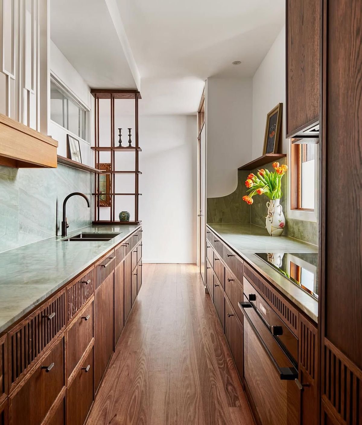
Wood storage walls and open shelves add texture to one side

One side becomes a full wall of wooden storage with open shelves, while the opposite side houses a functional counter. This creates a contrast between display and function without breaking the galley format.
A runner rug anchors the center and softens the transition between the two sides. The layout works because each wall has a clear role, so the narrow space doesn’t get overloaded.
An arched end wall and symmetrical cabinet runs frame the exit

An arched opening at the end changes the way the galley ends. Instead of a flat wall, the exit is framed, giving the corridor a defined end point with architectural details.
Cabinet runs on both sides remain balanced, with equal height and materials. This symmetry keeps the space structured, while the arch adds variety without obstructing the flow.
Paneled walls and brass details that add depth without breaking the layout

Vertical paneling runs with the cabinetry, adding texture without introducing new materials. Brass hardware and fixtures create small highlights throughout the surface, keeping the eye moving along the corridor.
Defines the runner path and centers the layout. Even with the added detail, the galley remains organized as everything follows the same linear direction from entry to exit.
A framed opening with a center table that turns the galley into a visual axis

The kitchen is set within a framed opening, which changes how the galley reads from the adjacent rooms. Instead of a hidden corridor, it becomes a defined zone with a clear boundary. A narrow center table reinforces the axle, which sits perfectly in line with the opening and rear door.
The cabinetry on both sides remains light, with brass hardware adding small points of contrast. Dark floors ground the space, preventing white surfaces from flattening the layout. This setup works because the galley is treated as both a passage and a display at the same time.
An all-white run with open shelving that keeps one side visually light

Both sides use white cabinetry, but the right wall features open shelving to reduce visual weight. This breaks the symmetry without disturbing the structure of the galley. A long countertop runs uninterrupted, keeping the workflow straight from front to back.
Light wood flooring runs the length of the kitchen and reflects natural light through the back door. The result is a narrow layout that feels expansive, not constricted, because there are no heavy interruptions along the walls.
Vaulted ceilings and muted green walls soften the effect of the corridor

The arch changes the assumption of an overhead galley. Instead of a straight ceiling line, a curve softens the transition from one zone to another. The muted green cabinetry blends into the walls, reducing contrast throughout the space.
Finally glass doors draw light into the full length of the kitchen. A small stool sits to the side, adding function without blocking the path. The layout remains clear as the center line remains open and uninterrupted.
A window bench at the end that transforms the galley into a destination

The back wall is not considered a stop point. It becomes a seating area with a built-in bench, turning the galley into a space you move towards, not just through. This shifts the layout from pure utility to something more useful.
Cabinet runs remain tight on both sides, but the bench presents depth at the end. Although the physical dimensions are narrow, the natural light from the window expands the perception of width.
Dark cabinetry and a brick wall add weight to one side

One side carries a full run of dark cabinetry with glass inserts, while the opposite wall presents exposed brick. This contrast creates strong material separation throughout the galley without breaking the linear flow.
A glass door at the end reflects light back into the space, balancing the darker tones. Hardware and fixtures in hot metal bind the two sides together, so the contrast reads as intentional rather than mismatched.
Continuous wooden cabinetry with integrated open dividers

Both sides use matching wood cabinetry, creating a seamless envelope around the corridor. An open vertical divider near the front introduces a break in the wall without closing off the space.
Countertop and backsplash run in the same tone, which reduces visual fragmentation. This keeps the galley calm and controlled, focusing on material continuity rather than contrast.
A patterned floor that drives movement through the galley

The floor becomes the main feature, using a diamond pattern that draws the eye straight into the kitchen. This reinforces the direction and makes the galley look longer than it is.
Cabinetry remains consistent and restrained, allowing the floor to define the space. The end opening connects to another room, so the pattern acts as a visual link between zones rather than stopping at the kitchen boundary.
A checkerboard floor with a runner that softens the narrow galley path

The black and white checkerboard floor sets a strong directional pattern that pushes the eye straight into the galley. Instead of leaving it open, the woven runner is placed along the midline, breaking up the contrast and adding a soft layer underfoot. This prevents the floor from dominating the space while still using it to define movement.
Cabinetry remains consistent on both sides in light tones, allowing the floor to carry the visual weight. The sink sits below the window, drawing natural light across the countertop and into the corridor. A small door at the end keeps the layout connected to the rest of the house, so the galley reads as part of the sequence, not a closed-off zone.