
In 2026, entryways are starting to function more like pass-through spaces and more like statement zones. Instead of a basic console and standard round mirror, homeowners are mixing sculptural furniture, oversized frames, textured finishes and dramatic shapes that turn the first few feet indoors into a focal point.

The biggest shift comes from contrast. Dark credenzas sit under metallic mirrors, floating consoles combine with oversized organic frames, and patterned cabinets replace flat painted furniture. Mirrors are no longer added just for reflection. They act like wall art that changes the scale, texture and mood of the entire entryway.
Some of these spaces are modern with curved black consoles and abstract mirrors. Others use carved wood, shell frames, or geometric cabinet fronts that push the room closer to boutique hotel design. The common thread remains the same. The console and mirror stop blending into the wall and guests immediately notice the room.
Geometric cabinet fronts turned this entryway into a statement wall

Repeating geometric carvings in the credenza transform the entire wall from flat storage to a textured focal point. Bronze tones layered on cabinet doors catch light differently throughout the room and keep large furniture pieces from looking overwhelming.
The curved upper mirror pushes the setup further away from standard entry styling. Instead of using a basic rectangle, the frame introduces movement that softens the sharp cabinet pattern below.
Layered mirror frames add depth without extra decoration

A mirror frame uses stacked stripes that draw attention outwards from the center reflection. It adds layered shape dimension before the eye reaches the console below.
A matching wall with geometric details in the cabinet fronts creates a connected furniture set without feeling repetitive. The pale finish also prevents large storage pieces from overwhelming the entry.
Metallic panels replaced flat cabinet doors

The credenza uses metallic textured inserts instead of smooth cabinet fronts. That small change creates more depth across the surface of the furniture and helps the wall reflect ambient light.
An oversized round mirror echoes the metallic finish and balances above the dark cabinet base. Together, the setup feels closer to a luxury hotel lobby than a standard hallway console.
Concrete and raw wood move the entry towards an organic modern design

This console eschews decorative carving altogether and relies instead on the contrast of raw materials. Thick concrete combined with natural wood framing creates a heavy architectural look that almost feels structural.
An oversized wooden mirror frame continues that natural texture upwards and adds warmth to the wall that balances the concrete base below.
Round mirrors soften the sharp bathroom layout

The asymmetrical mirror shape breaks up the tight vertical layout around the sink. Instead of other hard-edged rectangles, the curved frame adds softness above the narrow pedestal basin.
Glass pendant lighting also creates a layered reflection on the mirror surface and makes a compact setup feel larger without adding extra decor.
Floating glass turned this console into a sculpture

The curved wood base under the glass top becomes the entire focus of the console. Because the surface remains transparent, the base reads almost like an art piece rather than furniture.
The matching round mirrors above continue the curved theme and help collect the wall without crowding the narrow entry space.
The burnt wood texture added weight to the entire wall

This dark credenza uses a rough layered texture instead of a polished finish. The surface looks carved and weathered, giving the wall more presence than plain painted cabinetry.
A large metal mirror above reflects light back into the dark furniture arrangement and prevents the entry from feeling visually overwhelming.
A floating black console eliminates visual clutter

This setup entry will do almost nothing. A floating black console with rounded edges keeps the wall clean while cylindrical legs below add sculptural detail.
The round mirror continues the minimal shape language and helps the entryway feel custom built rather than cluttered with separate furniture pieces.
Sculpted bases in place of standard console legs

An oversized pedestal support under the console completely changes how the furniture reads. Instead of disappearing into the background, the base becomes the center of the wall.
The textured round mirror above adds another layer of dimension and helps balance the long black console below.
A shell texture turned a mirror into wall art

A shell-covered mirror frame creates a structure that stands out immediately against the plain wall behind it. Even with minimal styling below, the wall looks finished because the mirror has so much detail.
A narrow console table and fur-covered bench keep the lower half simple so that the mirror dominates.
Circular iron detail added vintage character

A dark mirror frame uses intersecting circular metalwork that gives the wall an old European look. Those layered details stand out more than a plain black frame and add depth without large artwork.
The turquoise console below introduces contrast that prevents the entry from falling into a purely neutral palette.
Fragmented mirror panels created a gallery effect

Instead of using one continuous reflective surface, this mirror is broken into multiple angled panels that spread the reflection across the wall. The result looks closer to an art installation than a standard vanity mirror.
A dark wood console below balances the reflective wall pieces and prevents the setup from feeling too stark or cold.
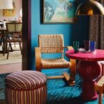
Turquoise frames draw attention to the entire entryway

Bright turquoise transforms this mirror from background decor to an instant wall focal point. The layered geometric frame shape adds further contrast against the dark color of the wall behind it.
The credenza bold pattern printed below continues the story and keeps the entry from becoming disconnected.
Plain painted cabinetry instead of printed furniture

The credenza surface uses a repeating looping pattern that creates movement across the cabinet face. Instead of blending into the wall, the furniture acts almost like wallpaper.
The etched white mirror frame above introduces another layer of texture while helping the busy cabinet pattern feel balanced rather than chaotic.
Shell-framed mirrors brought texture to the minimal walls

A shell-covered mirror frame adds texture without the need for bold color or large artwork. Against the muted wall, the reflective surface and organic border become enough to anchor the entire entry setup.
A narrow console below keeps the arrangement light while giving the wall structure and balance.