Want a kitchen that feels built, not decorated? In 2026, the backsplash is no longer the narrow strip between the counter and the cabinet. It extends into the entire wall surface that defines the entire cooking zone.

Natural stone drives this shift. Instead of repeating small tiles, designers use large, irregular pieces that bring depth, variety and weight. The wall stops acting like a finish and starts acting like a structure.
This kitchen shows how stone changes the way a space is read. Some wrap corners and frame windows, others extend over entire walls or sit behind sculptural hoods. Each goes beyond the traditional tile and turns the wall into an element that anchors the entire room.
A full height stone wall that frames the entire cooking area

Stone runs from wall to wall and floor to ceiling, turning the backsplash into a structural surface. There is no break between the backsplash and the wall. The range, hood and lighting sit within this stone field, giving a clear boundary to the cooking zone without the use of trim or tile edges.
What makes this work is consistency. The irregular pattern spreads over a large area, so it reads as architecture, not decoration. The island and cabinetry remain quiet, allowing the stone to carry the texture without making noise.
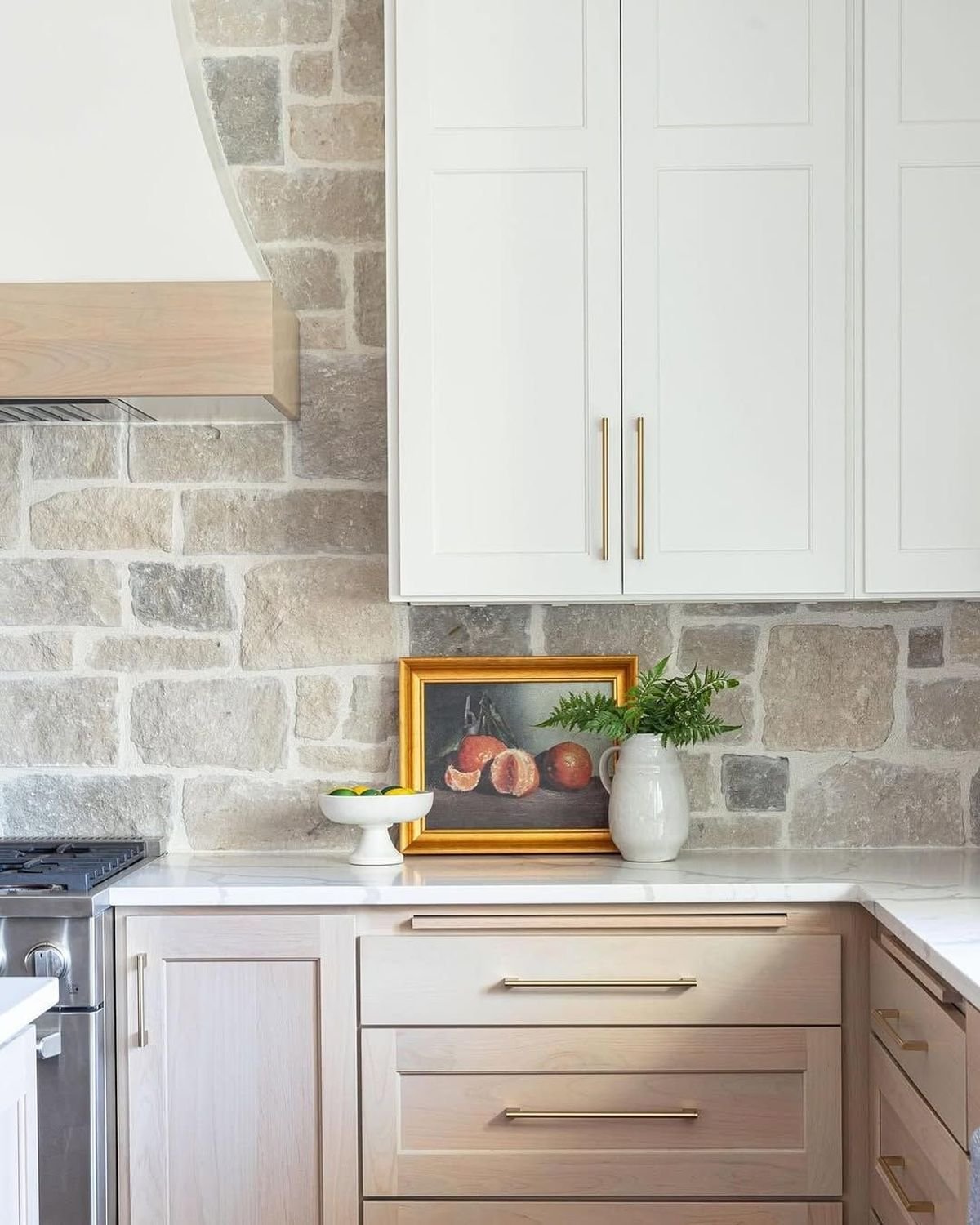
A warm limestone blend that softens the cabinet lines

The stone here has soft edges and lighter tones, which move the backsplash away from contrast and toward integration. It sits behind the Classic Cabinetry and Statement ranges, but doesn’t compete with either. The surface looks aged and stagnant.
This works because the color range stays tight. There are variations, but no sharp contrasts. It allows the hardware and range to stand out, while the wall holds everything together as a backdrop.
A stone backsplash with floating wooden shelves cut through it

The stone becomes a continuous layer, while thick wooden shelves cut it with sharp lines. This creates a tension between rough textures and clean edges. A dark hood adds another solid form that anchors the center.
What this work creates is a contrast in content, not in pattern. The stone remains irregular, while the shelves and hood remain precise. That balance prevents the wall from feeling heavy.
A light stone wall that blends into the window framing

The backsplash wraps around the window wall, eliminating any clear boundaries between zones. The stone continues behind the sink and around the frame, giving the entire corner a cohesive feel.
This works because of scale and light. The pale stone reflects natural light from the windows, so the composition remains visible without darkening the space. Cabinetry remains simple to avoid breaking the flow.
A mixed-tone stone that adds depth behind a statement range

Here the stone has more variation in tone from beige to grey. It sits behind a sturdy range and dark cabinetry, giving the wall more presence. The backsplash does not fade into the background.
The reason for this function is balance. Range and hardware have weight, so a variety is needed to match the wall. A flat surface will feel weak here. The stone holds its own without being possessed.
A tight-cut stone that almost reads like a pattern

The pieces are smaller and more evenly spaced, giving the wall a more controlled look. It still reads as stone, but the layout feels closer to a pattern than a random surface.
This works because it sits between the tile and the raw material. You gain texture without losing structure. In a small kitchen, this approach keeps the wall readable without being cluttered.
Used as a calming backdrop for stone backsplash styling

Stone sits behind everyday objects, art and kitchen tools. It doesn’t try to stand out. Instead, it supports everything that is put in front of it. The surface feels stable and neutral.
What makes this effective is moderation. Tones remain soft, and patterns remain consistent. It allows layering on the counter without visual conflict. The wall becomes a support, not a feature.
Corner-wrapped stone that eliminates backsplash boundaries

The stone continues unabated towards both walls and around corners. There is no line defining where the backsplash ends. The entire space seems wrapped in one material.
This works because it eliminates fragmentation. Instead of breaking the kitchen into sections, the stone creates one continuous surface. It makes the room feel larger and more connected.
Soft neutral stone paired with minimal cabinetry

The cabinetry remains light and simple, while the stone behind it adds a calming texture. A backsplash doesn’t compete with cabinet fronts or hardware. It fills the wall without adding visual weight.
The strength here is contrast in detail. Cabinets are flat and clean. The stone is textured and irregular. That difference creates depth without adding more ingredients.
A plaster hood set against a full stone wall

A stone wall serves as a backdrop for a large sculptural hood. The hood becomes the focal point, while the stone supports it with texture and depth. The island and cabinet remain subordinate.
This works because the roles are clear. The hood is the main form. The stone is the surface that holds it. Without the stone, the hood will seem disconnected from the wall.
A large stone layout that fills the open kitchen wall

The stone spans the wide wall and the front has open shelves. Holds multiple elements without breaking the surface. It reads as a continuous field behind everything.
What makes this work is the scale. The wall is large, so the stone pattern has room to breathe. A small tile will divide this space. The stone keeps it grounded and unified.
A full stone backdrop paired with woven pendants and a wooden island

The stone covers the entire back wall, running behind the range and between the two windows. It creates a sturdy surface that holds the structure in place while bringing warmth against the island and pendants. The contrast between rough stone and soft woven textures keeps the space balanced.
This works because the wall stays consistent while everything else falls in front of it. The island defines the function, the pendant defines the scale, and the stone holds the background. Nothing competes, every element has a role.
A soft beige stone that blends into the plaster hood and walls

The stone here sits close to the plaster hood and surrounding walls. There’s no sharp contrast, which makes the backsplash feel unified rather than separate. The surface reads as part of the architecture.
This works because the palette stays tight. The difference is in texture, not color. That wall allows fixtures and objects to stand out without drawing attention.
Mixed stone frames the windows as structural details

The stone wraps tightly around the window, turning it into a framed opening rather than a cutout in the drywall. The backsplash extends into the cooking zone, but the window becomes a central break in the surface.
This works because the stone adds weight around the opening. A flat wall makes the window look thin. The material gives depth and further defines the transition between inside and outside.
Stone wall supporting sculptural plaster hood and open shelving

The wall has a full spread of stone, while a large plaster hood and slim shelves sit out front. The shelves present horizontal lines that intersect the irregular pattern behind them.
This works because the layering is controlled. The hood is the main form, the shelves add function, and the stone remains as the base. Each layer adds something without creating clutter.
Deep green cabinetry set against a textured stone surface

Dark cabinetry pulls forward, while stone sits back as a textured field. The contrast between the smooth painted panels and the rough stone creates depth throughout the wall.
This works because the materials oppose each other. Flat cabinet fronts need texture behind them to avoid a flat result. Stone provides that without adding extra elements.
A long stone backsplash running the full length of the countertop

The stone extends across the kitchen wall and continues along the counter towards the windows. It eliminates the idea of a small backsplash zone and replaces it with a continuous surface.
This works because of the length. The extended run pattern settles and feels natural. Short sections will break the flow. Here, stone defines the entire wall.
Stone accent wall paired with large openings and natural light

Stone sits on one side while large doors and windows open up the space on the other. This creates a contrast between the heavy material and the exposed surfaces of the glass.
This works because space is divided by function. One side anchors with texture, the other opens with light. Stone keeps the kitchen from feeling too open.
Layered stone behind island with decorative elements in front

A stone wall sits behind the island, while decor, lighting and cabinetry make up the front layers. Backsplash doesn’t work alone, it supports the entire setup.
This works because the wall remains static while the foreground changes. Stone provides consistency, allowing style and movement without losing structure.
Structured stone layout with strict patterns and clean lines

The stone pieces are more uniform, creating a tight grid across the wall. It still reads like natural content, but with more control and configuration.
This works because it sits between rustic and modern. A cleaner layout pairs well with sharp cabinetry lines and large surfaces. It keeps texture without losing order.