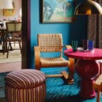
In 2026, furniture does much more than fill a room. Cabinets extend across entire walls, shelving systems behave like architecture, and lighting is built directly into the furniture itself. Instead of adding pieces one by one, designers create compositions that shape the entire space.

What I keep noticing is how the storage and display blend into the fabric of the room. Floating cabinets, integrated lighting, sculptural shelves and wall-length systems create interiors that feel deliberate and balanced. The furniture stops behaving as separate objects and starts to feel like a part of the architecture.
The interiors below show how this approach transforms everyday rooms. From library walls and sculptural sideboards to floating desks and modular shelving, each space demonstrates how thoughtful furniture design can bring depth, rhythm and visual structure to a modern home.
Modern walnut dining room with floating storage wall

This dining space demonstrates how storage space can become part of the architecture instead of just filling the wall. The composition of the floating shelves introduces multiple levels, hidden compartments and integrated lighting, which creates visual depth behind the dining table.
What works particularly well here is the balance between warm walnut and soft gray surfaces. Dark dining chairs ground the room, while a sculptural chandelier adds a dramatic focal point above the table.
I love how the wall system feels almost like a gallery installation. Books, ceramics and lighting turn storage into a curated display.
Asymmetric floating shelf system with built-in lighting

This wall composition proves that shelves can behave like a design sculpture. The layout deliberately breaks symmetry, creating a layered structure that feels dynamic without becoming chaotic.
Integrated LED lighting changes everything. Rather than relying solely on light from above, the shelves create their own ambient light that highlights objects and adds depth to the wall.
Design-wise, this type of shelving works beautifully in modern dining rooms or offices where the wall needs both storage and architectural interest.
Modern brass and walnut console table with framed mirror

This console setup shows how the contrast of materials can elevate a simple piece of furniture into something memorable. The warm walnut cabinet provides depth, while the polished brass side panel introduces a subtle metallic accent.
The large framed mirror doubles the impact of the space by reflecting the sculptural chandelier behind it. It turns a simple console into a focal point that visually expands the room.
I especially like the way the styling is kept understated. A few glass containers and books let the materials remain the star.
Terracotta wall with floating cabinet composition

The terracotta wall color creates a bold architectural backdrop for this floating cabinet system. Against the background of the warm textured surface, the dark wood cabinets and brass details look rich and refined.
Multi-layer lighting plays a major role here. The LED strip above the wall creates a soft wash of light that enhances the texture of the paint, while the cabinets appear to float beneath it.
This is a great example of how modern furniture design merges with interior architecture. The cabinet becomes part of the wall instead of standing against it.
Minimal modern art gallery style buffet

This living room setting looks calm, refined and extremely balanced. A low walnut sideboard anchors the wall, while two abstract artworks above create a simple yet striking gallery composition.
A soft neutral palette keeps the focus on shapes and materials. The rounded chairs in the foreground contrast with the linear cabinet, creating a combination of geometry that feels intentional.
What I appreciate most here is the restraint. The style is minimalist, but the room still feels layered and finished.
Glass wardrobe with floating storage system

This closet uses glass doors and a floating storage wall to create a display that feels closer to a boutique showroom than a typical closet. Open shelving, soft lighting and symmetrical compartments keep everything visible and organized without feeling cluttered.
What stands out here is how the lighting is integrated into the structure of the shelves. Instead of relying only on ceiling lighting, each section is illuminated so that the clothes and accessories become part of the visual composition. The result is a wardrobe that looks more designed than just functional.
Blue panel wall with minimalist storage console

The wall behind this console is treated almost like a system of architectural panels. Vertical divisions create a rhythm across the surface, while a hidden LED strip highlights the texture and color of the panels.
I like how the console stays visually quiet while the wall does most of the work. Books, ceramics and a small lamp introduce personality without disturbing the calm symmetry of the composition.
This is a great example of how a simple piece of furniture becomes more interesting when combined with a carefully designed wall surface.
Library storage with full wall and sliding panels

Large storage walls like this are becoming more common in modern interiors. Instead of individual bookcases, the entire wall becomes a modular bookcase with integrated display sections and sliding panels.
Sliding doors help control visual clutter. When closed, the wall reads as a calm architectural surface. When opened, it reveals shelves filled with books and decorative objects.
I also appreciate the illuminated display niches in the center. They create focal points that break up the grid and give the wall a gallery character.
Modern living room with floating cabinets and circular lighting

This living room composition shows how wall systems can stretch across the entire seating area without feeling heavy. A long floating cabinet anchors the space, while smaller boxes and shelves create layers above it.
Round wall lights introduce a sculptural element that contrasts with the horizontal lines of the furniture. Together they create a balanced composition where lighting becomes part of the architecture.
The warm tones of the leather sofa and neutral walls help soften the darker furniture, keeping the room comfortable and not overly dramatic.
Dining room with long black open shelves

This dining area demonstrates how open shelving can stretch across the wall while still feeling light and structured. Thin metal supports create horizontal layers that display books and decorative objects without blocking the wall behind them.
What works here is the balance between the furniture and the composition of the dining table. The sculptural base of the table and the soft upholstered chairs introduce a contrast against the linear structure of the shelves.
This type of shelving works particularly well in open-plan interiors where storage needs to look both decorative and practical.
Sculptural red sideboard with geometric cabinet fronts

The bold red buffet is an instant eye-catcher in this otherwise neutral space. Its geometric door pattern adds texture, while the long horizontal shape keeps the furniture visually grounded.
Above it, wall niches and marble panels introduce additional vertical elements. Together, they create a layered composition that feels curated rather than crowded.
I love how the accessories are kept minimal. A few lamps and vases are enough to highlight the furniture without distracting from its strong color.
Modular wall storage next to a contemporary sofa

This wall storage system looks almost like a hanging sculpture. Individual modules combine open shelves, closed cabinets and metal frames to create a composition that grows vertically across the wall.
Placed next to the leather sofa, the shelf becomes part of the architecture of the living room, not just a storage solution. Books, objects and plants soften the structure and make it feel inhabited.
It’s a smart approach for smaller living rooms where each wall unit needs to provide both storage and visual interest.
Hexagonal mirror wall with walnut sideboard

The hexagonal mirror adds a geometric focal point above the walnut sideboard. Instead of one large mirror, the two linked shapes create movement and reflect light from different angles.
The sideboard itself maintains a calm, refined presence with warm wood panels and a dark center accent. Decorative elements remain understated, allowing mirrors to become the main visual feature.
Together, they create an entryway or entryway that feels elegant without relying on heavy decoration.
Floating desk with integrated storage system

This floating desk demonstrates how a workspace can be integrated into the architecture of a room. A long wooden surface spans the wall, while storage units above and below keep everything organized.
Glossy red drawers introduce contrast and a modern graphic element. They break up the otherwise natural palette and add personality to the workstation.
I also like the slim shelf above the desk. It keeps the wall visually light while providing space for books and framed objects.
Minimal living room with sculptural sofa and metal shelving tower

This living room uses very few elements, but each piece carries a strong visual weight. The huge sculptural sofa immediately anchors the space, while the tall metal shelf introduces vertical structure.
The shelf tower looks almost architectural. Its thin metal frame keeps the room open, while the stacked books create a grid rhythm.
Combined with the large artwork on the wall, the room achieves a relaxed, gallery-like atmosphere where furniture and art share equal presence.